NATPRO Brand Identity Design

Born from the words Natural Product, NATPRO represents a modern approach to wellness — where science meets the purity of nature. At its core, NATPRO is guided by three principles: Natural. Safe. Effective.
Every formulation is crafted with care, using plant-based ingredients backed by evidence-based research. From supporting respiratory health to enhancing metabolic balance, NATPRO’s mission is to help people nurture their wellness naturally — one daily habit at a time.
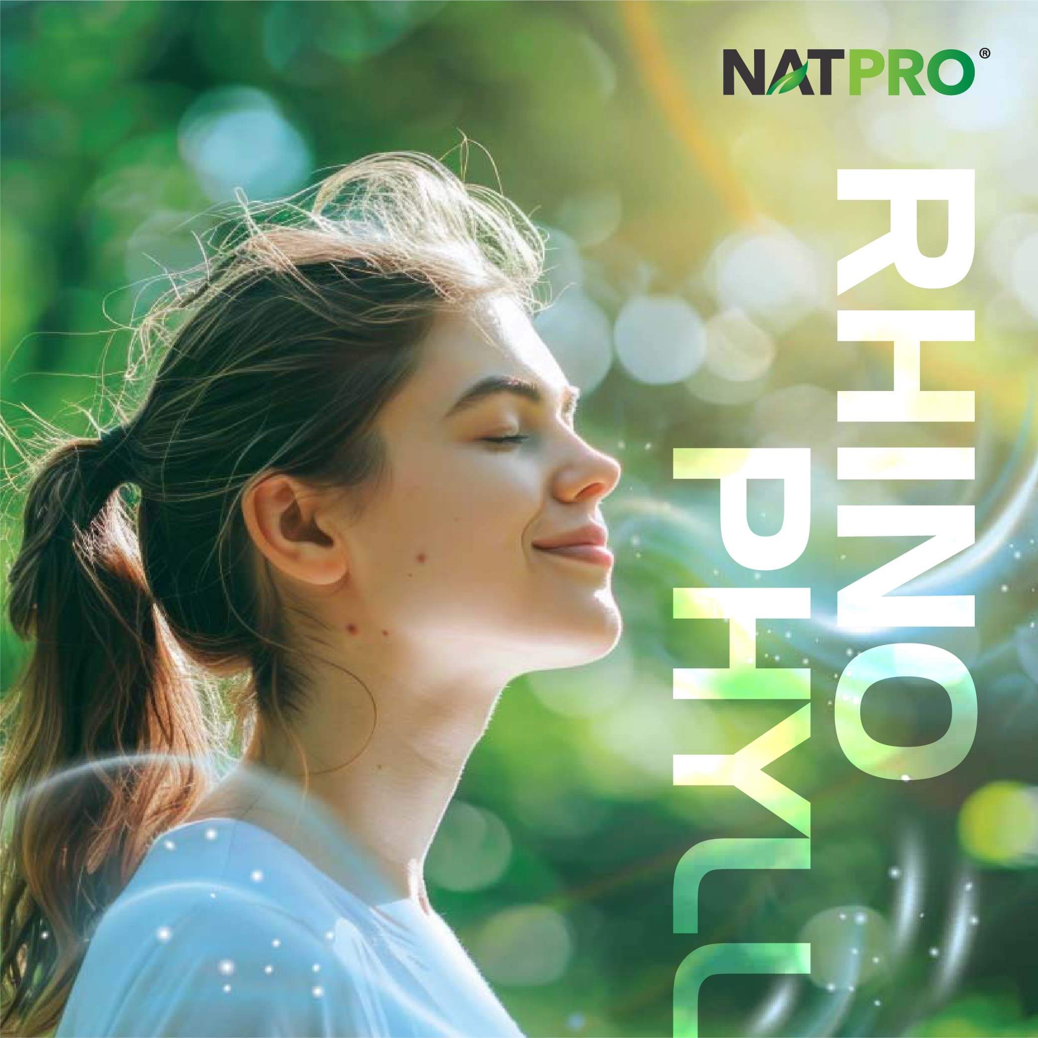
Through its sub-brands, REGUMET 3™ and RHYNOPHYLL™, NATPRO continues to empower individuals to take charge of their health the natural way, with products that are safe, trusted, and results-driven.
- Brand Identity Design
- Creative Direction
- Logo Design
- Stationery Design
- Packaging Design
- Brochure Design
- Bunting Design
- Exhibition Booth Design
Brand Design Rationale
The NATPRO visual identity captures the harmony between nature and modern wellness.
The logo features a clean sans-serif typeface with a leaf motif subtly embedded in the letter A, symbolising the brand’s natural foundation and scientific precision. A palette of vibrant greens — ranging from light lime to deep forest tones — evokes freshness, vitality, and growth.
Supporting graphics flow with soft organic curves, inspired by the movement of leaves and nature’s balance. Together, they create a contemporary yet approachable look that reflects NATPRO’s promise to bring clarity, care, and confidence to natural wellness.